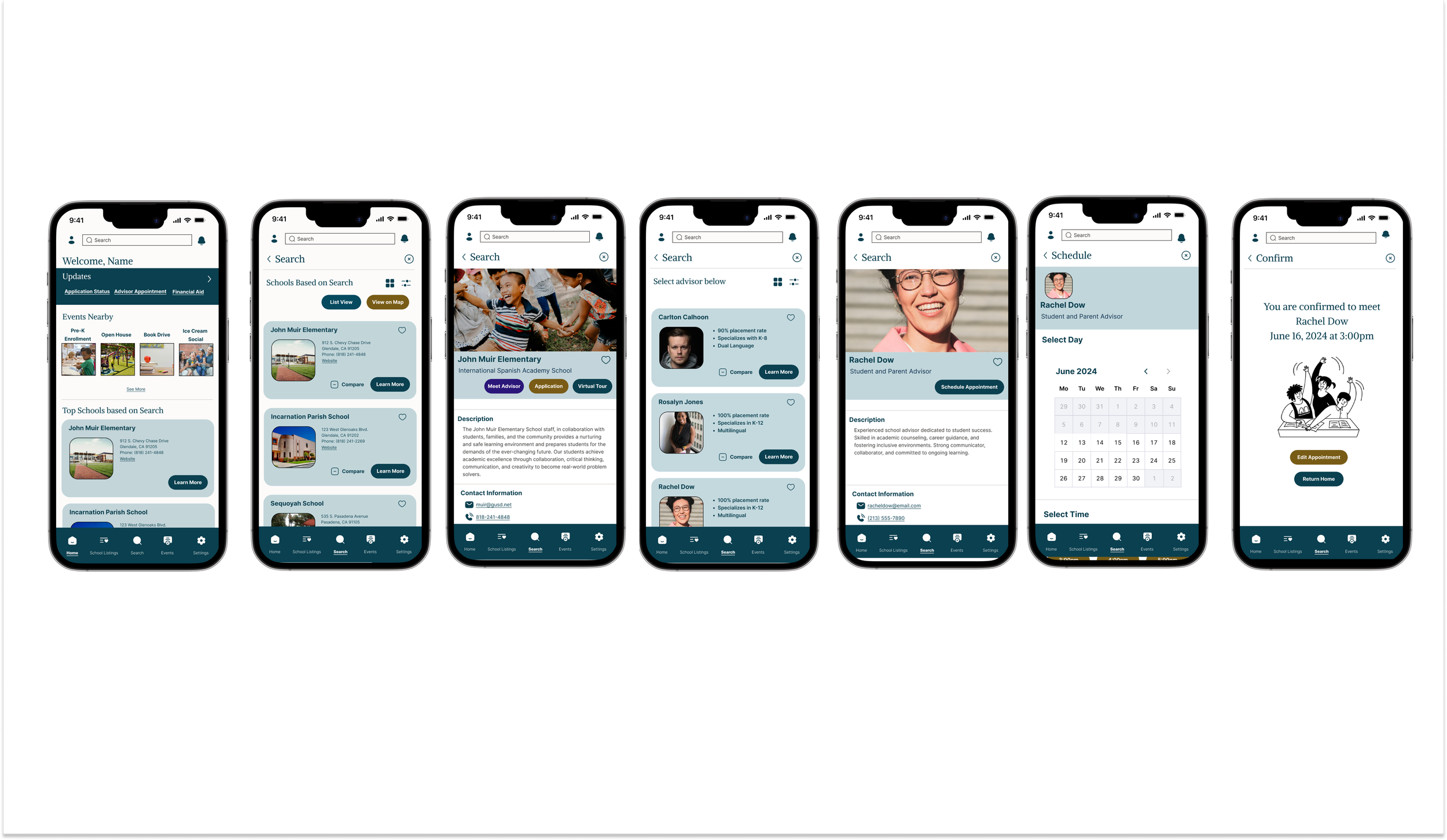
This was a project provided by Flatiron to research, ideate, and build prototypes based on research. The end use was to build a high fidelity prototype that focuses on parents filtering schools by specific needs and schools marketing themselves/highlighting their strengths in a single format
My role: UX/UI Designer

image of children in classroom
There is a missing link in the market for a single source for parents to search for schools. Often they do their own research through internet searches, word of mouth and community events. The app is a work in progress to help mend that gap.
About The Project
Project Goals
Each parent/guardian has specific ideals for their child, but they had a difficult time assessing and finding schools that fit their needs. The search was extensive and without much result. The schools struggled to reach the parents without local events or word of mouth.
What’s the value proposition?
This would provide a single source for parents/guardians to connect with schools that match their vision for their child’s growth, potential, and ultimately their life path.
Project Results
After studying the interviews I created an affinity diagram, an empathy map, conducted competitive analysis I gathered that most parents found it hard to find schools in general. Once they are able to find some resources for schools, they struggle to find one that fits the vision they have for their child. Most parents want to invest into a school that can help shape the character and intellectual outcome of their child. They want to create a confident child that is inclusive, educated and cultured. The research showed that it is difficult for the parents to find everything they are looking for through the search methods they currently have.
The Challenge
This product is trying to solve the need for parents to have a single trusted source to find the right school for their child.
Problem Statement
Parents, Guardians, and Caregivers with children in school need a search engine to help them find private schools that accommodate all types of kids in order to give them the most in-depth and well-rounded education.
Parent’s, caregivers, or guardians in North American who have high ambitions for the future of their child who need a product that is reliable, full of information and efficient to find the best school match.
Target Audience
Who wants this product?
Parents, caregivers or guardians
Open to any age range or sexual orientation
Research is based on North American schools- so targets Canada and united states mostly.
Parents who have high ambitions and want the best for their kids
mostly busy working parents or one working parent household that have active lifestyles.
User Needs
What the research showed
the user wants the best education and activities for their child
user wants their child to have the type of education style that they think is best
user wants child to have opportunities that will shape their future personality, ambition and goals
user needs a product that will take on the research for them so they can use the product freely and with trust
the user based their educational research on word of mouth and their own research- the app needs to be trustworthy for the news to spread
the user needs to trust the product to take the search responsibility off their plate so they can focus on their child
What is on the market
I found a few options that were comparable, one being Niche. This app is targeted to all students in various levels of education. The student can use the app themselves or a parent can use it. . Based on the research and interviews, this product is more focused on early education and should be marketed towards parents and the hopes they have for their child’s future. Offering a range of inclusivity, cultural programs, and extra curricular activities were all mentioned by the interviewees.
Affinity Map
How I started
I first took the interviews and pulled out some quotes that stood out base on the Problem Statement. Then I organized it into an Affinity Diagram. This was extremely helpful to see the themes that stood out the most. I broke them down into 5 themes:
School Features- Logistics and how to find
Future Ideals for Children
School Features- Emotional and Character Growth
School Features- Inclusivity
Final Decision Advise
Empathy Map
Understanding the User
Next I took the information gathered and created an Empathy map- this ultimately helped me see what the user’s needs were in a more digestible way. I pulled out 5 themes:
Influences: what directs or changes their search or influences the decision
Pain points: lack of features that ultimately deters the parent
Tasks: How they went about finding the schools
Feelings: How the process made them feel and stirred influence
Goals: The ultimate reasoning into why a parent choses the school.
to see the detailed map click here
Market Research
Image of Niche logo
Image of themes from Affinity Map
Image of Task Flow 1 after crazy 8s
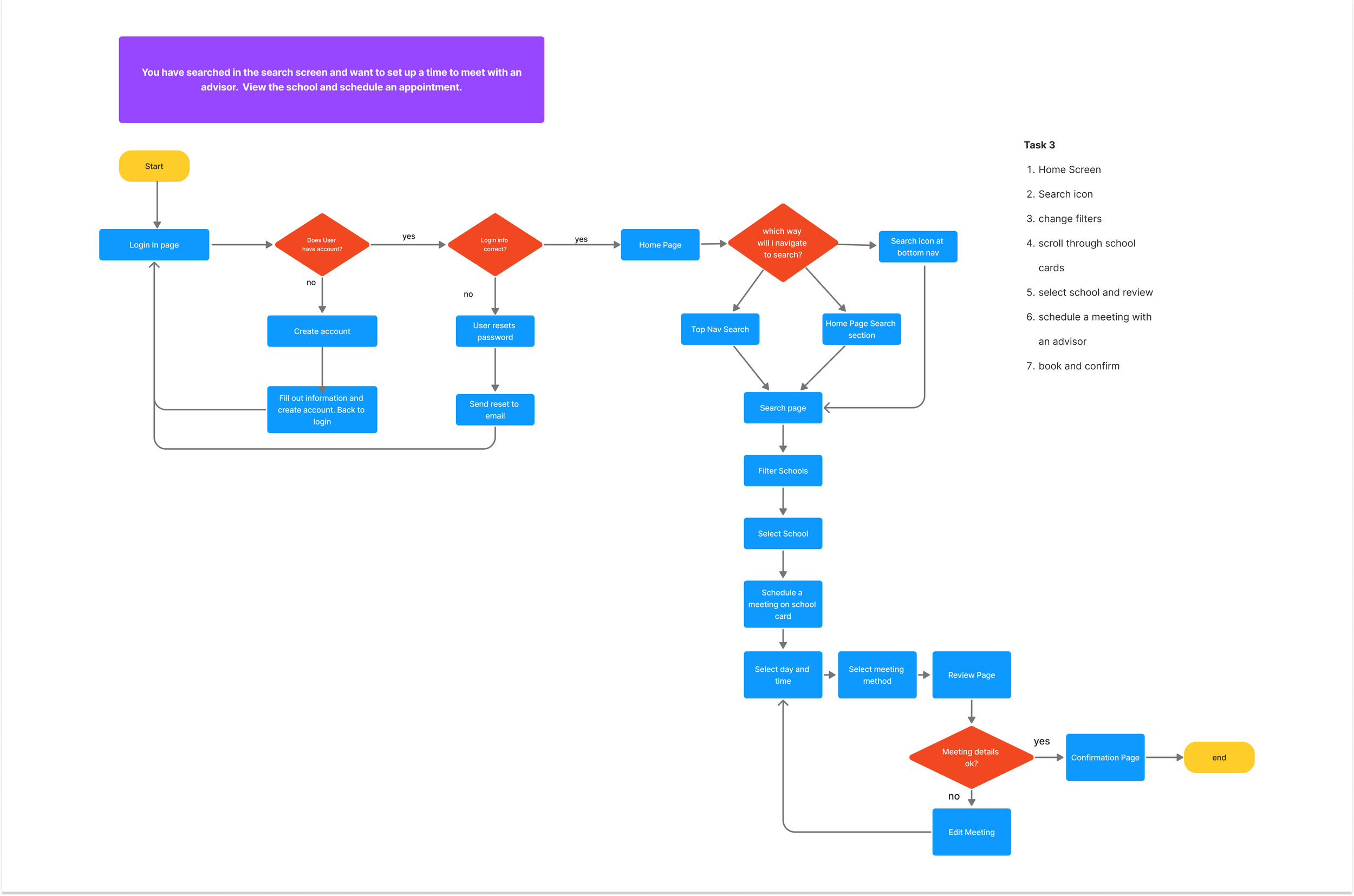
Based on the scenarios, I made flow diagrams to help focus into the prototype
Prototyping
Low Fidelity Prototype
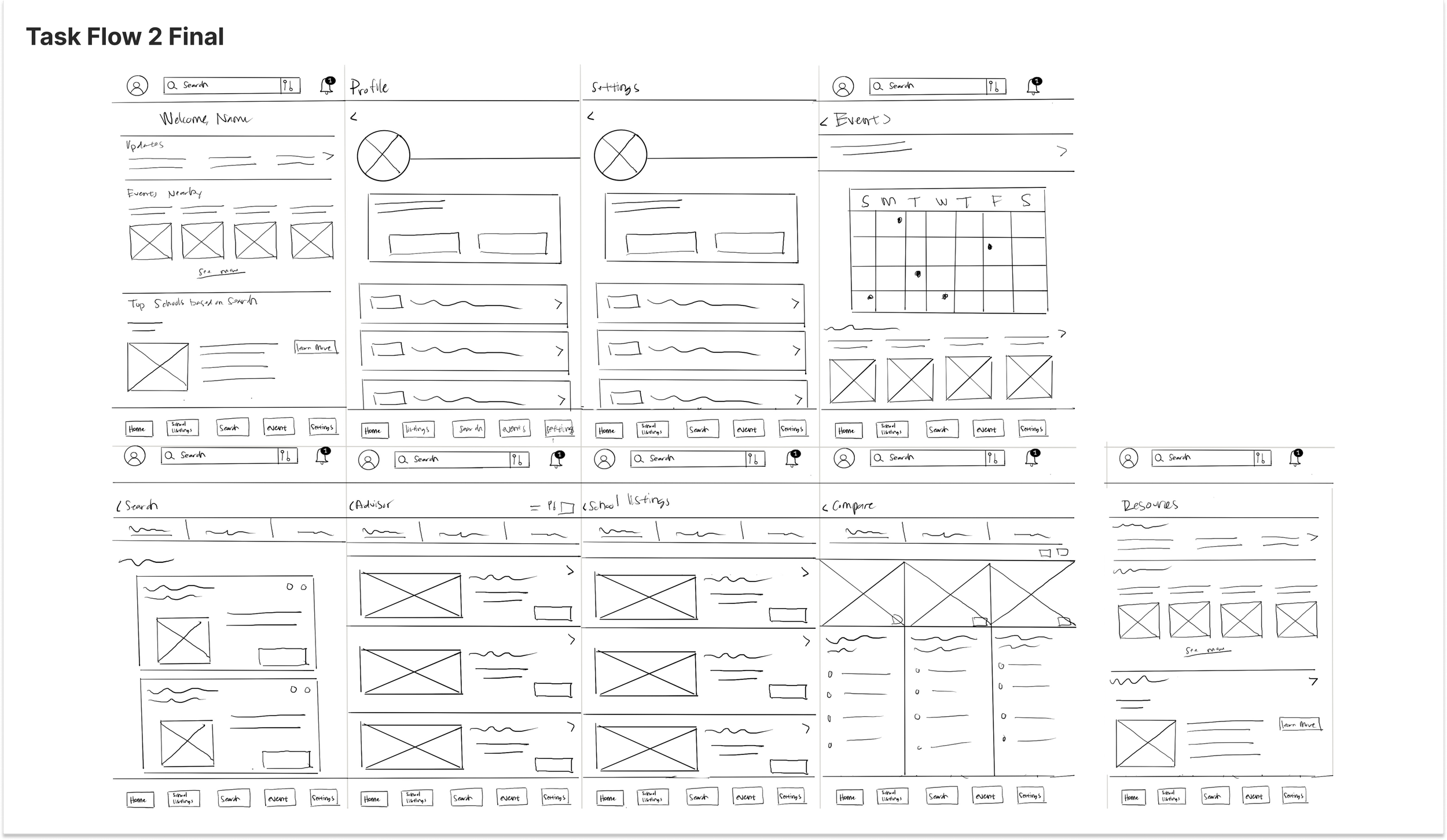
I started out by making a list of screens I thought were important and sketched into ideas. After creating 8 variations for each screen I developed into three task flows:
Task Scenario 1:
You want to check your personal information to edit your contact information, Go to the profile screen and check see if your information is correct, once checked save and return home.
Task Scenario 2:
You have searched on the search screen but you want to compare the two schools you selected. Select the schools and view the options on the compare screen.
Task Scenario 3:
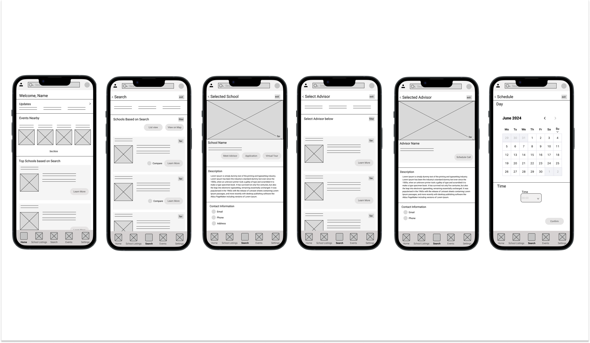
You have searched in the search screen and want to set up a time to meet with an advisor. View the school and schedule an appointment.
After this I developed a user test plan to help guide my research.
Task 3 LOFI Prototype
Image of Flow Diagram Task 3
Once all of this was completed I developed my prototype
User Test Results
After testing on three users, the most repeated feedback was within the search methods and bottom doc navigation. Most users were able to complete the tasks at a 90% or higher conversion rate and the time on tasks was 10-30 seconds between all the tasks. Overall the users felt the tasks were easy to accomplish but there were suggestions to add more compare features on the home page, add more detail into the advisor scheduling, rework the bottom doc to exclude an option
(search and school listings felt repetitive)
High Fidelity Prototype
Task 3 HIFI prototype
What’s next?
As a jr. designer, I have much to improve to improve this product. I would love to improve the mircro interactions, rework some of the button colors, rework the bottom doc, rework the negative space on the screens, and overall keep the accessibility in mind.


